When you click on links to various merchants on this site and make a purchase, this can result in this site earning a commission. Affiliate programs and affiliations include, but are not limited to, the eBay Partner Network.
Antique 1920s–1930s K & R Countrymaid Food Products Sign 🧺 Hastings Nebraska NOS
🌾 There is a particular kind of American commercial art that never made it into museums, never landed in galleries, and never got studied in design schools — and yet it is some of the most honest graphic work this country ever produced. The K & R Countrymaid Food Products store display sign is exactly that kind of piece. Printed on hard cardboard stock for butcher shops and general stores across Nebraska, it carried one job: to make a shopper stop, look, and trust. Decades later, it does that job just as well from a kitchen wall or a collector's shelf as it ever did behind a meat counter in Hastings. 🥩
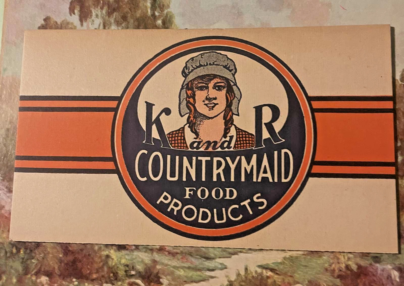
This is a New Old Stock (NOS) antique cardboard store display sign for K & R Countrymaid Food Products of Hastings, Nebraska, dating to the 1920s–1940s era of American regional food advertising. Signs of this type measure approximately 11 x 4.25 inches in the larger variant, consistent with competing listings for the same K & R Countrymaid sign series documented across multiple collector platforms. 📐
🎨 WHAT YOU ARE LOOKING AT
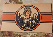
The sign is printed on a cream-toned cardboard ground, and the design is built around a central circular medallion — bold, confident, and drawn with the kind of deliberate craft that commercial lithographers brought to trade work in the decades before offset printing changed everything. The medallion is ringed in deep navy and orange, and at its center is the face of a young woman in a bonnet, hair in long plaits, wearing a checked garment — the Countrymaid herself, that Victorian dairy-maid figure that collectors have been chasing for years. She looks out from the circle with the calm expression of a brand mascot who has absolute faith in her product. 🧺
Flanking her portrait inside the medallion, the initials K and R anchor the left and right sides of the circle, with the word "and" connecting them in a flowing script. Below her image, in strong white lettering against the navy lower arc of the medallion: COUNTRYMAID FOOD PRODUCTS. The whole medallion is intersected by a bold horizontal orange stripe — two parallel bands of deep orange running edge to edge across the full width of the sign, interrupted only by the central circle itself. It is a graphic decision that gives the piece tremendous visual energy, the kind of lateral thrust that pulls the eye across a crowded butcher case or a busy general store shelf. 🔶
The printing is clean, the color registration is tight, and the palette — cream, orange, navy, and black — reads with the full chromatic weight of stock that was never subjected to the fading that comes from years of shop-window sunlight or fluorescent-light exposure. This is New Old Stock (NOS), and the condition speaks for itself.
🏙️ HASTINGS, NEBRASKA — A TOWN THAT FED AMERICA
To understand what K & R Countrymaid meant, you have to understand what Hastings, Nebraska was in the 1920s and 1930s. It was not a sleepy prairie town. It was a food industry hub — a rail-connected, distribution-savvy, entrepreneurially charged city where a man with a good product and a better label could build a regional brand that moved across the Great Plains and into grocery stores and butcher shops from Kansas to the Dakotas. 🚂
The most famous example is Kool-Aid. In 1920, Edwin Perkins relocated his food products business to Hastings because the rail connections made distribution a practical reality, and within a few years he had developed the powdered drink mix that would eventually become an American icon. That is the Hastings context: this was a city where food entrepreneurs were not the exception — they were the culture. K & R Inc. lived in that same ecosystem, competing for shelf space, fighting for brand recognition, and commissioning the kind of bold, unmistakable trade graphics that would stop a shopper cold. 🌽
K & R Inc. is documented through its surviving ephemera — signs, labels, and at least one 50-pound lard tin that has surfaced in the collector market — and the Countrymaid brand identity was consistent and deliberate. The company produced sausages and lard under the Countrymaid name, and their advertising materials were placed in the butcher shops and general stores that formed the backbone of Nebraska's retail food economy in those decades. The Victorian dairy maid, with her bonnet and braids and wholesome rural affect, was not an accidental design choice. She was a calculated statement in a market where nationally distributed industrial brands were starting to crowd the shelves. K & R was saying: this product comes from people like you, people who know what good food looks like, people who have been making it this way for generations. It was a positioning strategy dressed up in printer's ink and cardboard. 🧀
🌾 THE LORE THAT SURROUNDS THESE SIGNS
Here is where the story gets interesting, because with K & R Countrymaid, the collector lore runs ahead of the documented record — and that is part of what makes the piece compelling.
No founding date for K & R Inc. has surfaced in accessible archives. No owner names, no corporate registration records, no dissolution filing. The company is known entirely through what it left behind: the signs, the labels, the lard tins. Collectors who have tracked these pieces for years sometimes circulate a theory that K & R may have folded or changed hands quite suddenly — the argument being that NOS advertising stock of this quality does not survive in quantity unless it was warehoused and never distributed, which in turn suggests a company that went dark before its advertising budget ran out. Whether that is true or simply the kind of narrative that attaches itself to orphaned ephemera, it is part of the Countrymaid lore. 📦
Old-timers in the Nebraska collector community have placed these signs in the tradition of a very specific moment in Plains food history — the window between the consolidation of regional meatpacking after World War One and the arrival of nationally distributed brands that would eventually squeeze out the local operators. In that window, a company like K & R could still command real shelf space and real loyalty, and a sign like this one was the ambassador that walked into every butcher shop in south-central Nebraska and made the case. That the signs survive in NOS condition — unissued, unposted, unkissed by a thumbtack — suggests they were printed in quantity, stacked in a warehouse, and simply never deployed before the moment passed. 🏚️
There is also the matter of the Countrymaid herself. The braided-hair, bonneted dairy maid figure was a visual type with deep roots in American and European food advertising, reaching back to the Victorian era when the farm-fresh, handmade, rural-honest image was the premium sell in a world just beginning to grapple with industrial food production. By the time K & R was printing these signs in the 1920s and 1930s, that visual language was already nostalgic — which was precisely the point. The Countrymaid was not depicting the actual production of K & R lard and sausage. She was invoking a feeling about it. A rumor from the era held that regional Nebraska food companies specifically commissioned their graphics to look older and more established than they were, borrowing the visual authority of a longer tradition to compete with the national brands that had actual decades of advertising behind them. Whether K & R followed that playbook deliberately or simply hired a lithographer who knew the vocabulary, the Countrymaid reads exactly that way. 🧑🌾
🖼️ THE WORLD THESE SIGNS LIVED IN
Picture the interior of a Hastings-area butcher shop or general store in 1930. The counter runs the length of the room, glass cases holding the cuts, sawdust on the floor, a hand-lettered price board above the register. On the back wall and along the counter edge, manufacturer's display signs compete for the butcher's favor and the customer's attention. Some are lithographed tin. Some are paper on cardboard. The good ones — the ones that actually stopped traffic — were the ones with strong color, a recognizable figure, and lettering you could read from ten feet away. 🏪
The K & R Countrymaid sign was built for exactly that environment. The orange stripe reads from across a room. The circular medallion draws the eye. The dairy maid anchors the brand identity in a single image. This was not decorative — it was functional commercial art doing the hardest possible job in the most competitive possible setting.
And then, for whatever reason, some portion of the print run never made it out of the warehouse. The signs stayed stacked. The company moved on, or folded, or merged, or simply stopped buying advertising that season. The stock sat. And decades later, collectors discovered it — sharp, clean, full-color, exactly as it came off the press — and recognized it for what it is: a perfect little artifact of a specific American food industry moment that most people have forgotten entirely. 📬
🏛️ THE HASTINGS COLD STORAGE CONNECTION
The second photograph in this listing shows a massive, ornate red brick building sitting at a street corner in what is unmistakably an American Midwest city. The signage on the building reads HASTINGS COLD STORAGE. This is the infrastructure context for everything K & R Countrymaid represents. A facility of this scale — multiple stories, elaborate corbeled brickwork, arched windows, the kind of construction investment that signals serious commercial ambition — tells you everything about what Hastings was as a food industry center in the early twentieth century. 🧱
Cold storage of this size was the backbone of regional meat processing. Without it, a company like K & R could not have stored and distributed lard and sausage across a multi-county or multi-state territory. The fact that Hastings had a cold storage facility of this architectural ambition tells you that the food processing industry there was not a cottage operation — it was capitalized, infrastructure-supported, and built for scale. The Countrymaid brand was not operating in a backwater. It was operating in a regional food economy with genuine industrial capacity behind it. 🏗️
The building itself, with its Romanesque Revival brickwork and corner placement, looks to date from the 1890s or early 1900s — built in the era when cold storage was a transformative technology and the companies that controlled it were investing in permanence. That a facility like this existed in Hastings, and that K & R was operating in the same city at the same time the Countrymaid signs were being printed, is the physical-world context that makes the sign more than just pretty paper. It is a document of a whole regional food economy. ❄️
🧺 FOR THE COLLECTOR
The K & R Countrymaid store display sign lands in a very specific collector sweet spot. It speaks to Nebraska regional history, early twentieth-century food industry ephemera, American commercial lithography, butcher shop and general store advertising, and the broader story of how regional brands built identity and competed against the national players. 🗺️
It frames beautifully. The orange and navy against the cream ground is a strong palette, the circular medallion has genuine graphic authority, and the dairy maid figure carries the same visual warmth she always did. On a kitchen wall, in a study, alongside other Plains States ephemera, or as part of a focused collection of food industry advertising — it holds its own in any context.
K & R Countrymaid is not a brand that shows up in food history textbooks. It is not a name that gets mentioned in the Kool-Aid story, even though it came from the same city and the same entrepreneurial moment. It is the kind of company that existed entirely in the everyday fabric of a regional economy and left almost no paper trail outside of the things it made and the signs it printed. Which means the signs are the archive. What survives is what there is. 🌻
This one survived in fine shape. It is ready for the next collector who knows what it represents.
🔍 Search terms: K and R Countrymaid, Hastings Nebraska food history, vintage food advertising sign, Nebraska ephemera, butcher shop display sign, antique cardboard sign, 1920s food label, 1930s food advertising, Plains States Americana, dairy maid graphic, vintage lard advertising, vintage sausage advertising, NOS store display sign, American food industry collectible, Great Plains regional brand, vintage grocery store sign, Nebraska antique, Victorian dairy maid, food ephemera collector, Midwest food history